Definition
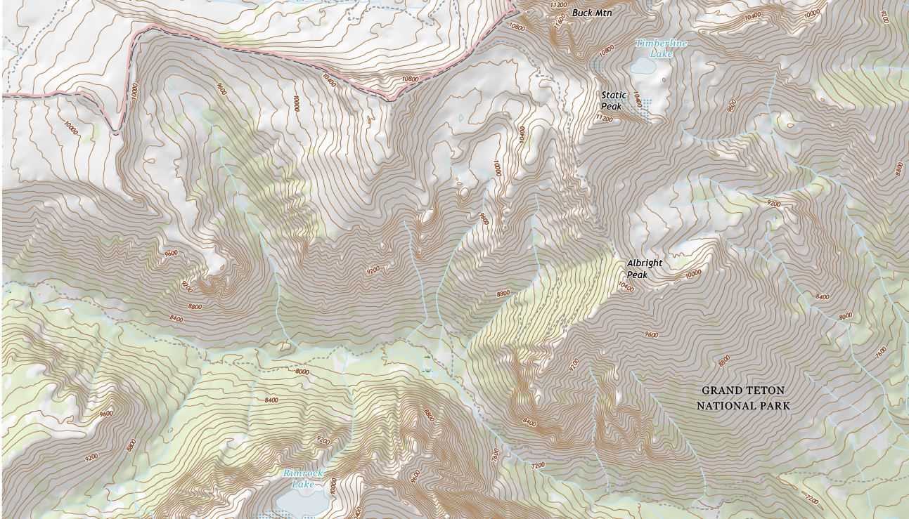
A relief map is any map designed to show the height and shape of the land, not just where roads, borders, or rivers are located. Because a standard map is flat and the real landscape it represents is not, mapmakers rely on a handful of visual techniques, contour lines, color elevation scales, and shaded relief, to suggest the third dimension on a two-dimensional page or screen. None of these techniques show elevation directly the way a photograph would; each one is a visual code that a reader has to learn to interpret, and most detailed maps combine more than one of these techniques at once.
How It Forms
There is no single correct way to show elevation on a map. Different techniques trade off detail, clarity, and ease of production, and cartographers often layer several together depending on how the map will be used.
- Contour lines connect points of equal elevation.
The most precise and widely used method draws a contour line through every point on the map that sits at the same height above sea level, then repeats this at a fixed vertical spacing called the contour interval. Reading the pattern of these lines reveals the shape of the land: widely spaced contours indicate a gentle slope, tightly packed contours indicate a steep one, and a set of closed loops indicates a hill or a depression, depending on which way the elevation numbers increase.
- Hypsometric tints add color by elevation band.
Many maps shade the area between contour lines with color, assigning a different color to each elevation range in a system called hypsometric tinting. A common convention uses greens for low elevations, moving through yellows and browns at mid-elevations, to white near the highest peaks, though the specific color scheme varies between mapmakers and must always be checked against the map's legend rather than assumed.
- Relief shading simulates light and shadow.
To make terrain easier to visualize at a glance, many maps add relief shading, sometimes called hillshading, which simulates how sunlight would fall across the landscape from a fixed direction, usually the upper left. Slopes facing the simulated light appear bright and slopes facing away appear shaded, giving the land a three-dimensional appearance even though the map itself is flat.
- Digital elevation models support modern mapping.
Most elevation maps produced today begin with a digital elevation model, a grid of elevation values collected by satellite radar, laser scanning known as lidar, or sonar for underwater terrain. These digital models can generate contour lines, hypsometric tints, and relief shading automatically, and they also make it possible to calculate slope, visibility, and drainage patterns far more precisely than earlier survey methods allowed.
Formation Timescale
Techniques for showing elevation on a map have changed dramatically over time, even though the underlying landscape they describe changes comparatively slowly. Early maps used hachures, short parallel lines drawn down the slope, to suggest steepness without giving a precise elevation at all. Contour lines became the standard method through the nineteenth and twentieth centuries as systematic land surveys made precise elevation measurement practical at large scale. Since the late twentieth century, satellite radar and laser-based lidar surveys have replaced most ground-based elevation surveying, making digital elevation models detailed enough to map elevation to within a meter or better across huge areas, and that precision continues to improve as newer satellite missions and scanning technology are introduced.
Main Characteristics
- A clear contour interval: the map should state the vertical distance between contour lines, since the same visual spacing means something different on a map with a 10-meter interval than one with a 100-meter interval.
- A legend explaining any color scale: hypsometric tints vary between maps, so a reliable map always explains what each color band represents rather than assuming a universal standard.
- Consistent light direction in relief shading: shaded relief should simulate light from a single, stated direction; inconsistent shading can make hills look like depressions and vice versa.
- A stated vertical datum: elevation is only meaningful relative to a reference point, almost always mean sea level, and precise work should state which sea-level reference, or datum, was used.
- Appropriate resolution for its scale: a continental-scale map and a single-trail hiking map require very different levels of elevation detail to remain both accurate and readable.
Materials and Structures Involved
Modern elevation maps are built from several kinds of measurement. Satellite radar missions can measure the elevation of the land surface across nearly the entire globe, including remote regions that would be impractical to survey on foot. Airborne and ground-based lidar surveys use laser pulses to measure elevation with far greater precision over smaller areas, commonly used for detailed engineering and flood-risk mapping. Underwater elevation, usually called bathymetry, is measured by sonar from ships or, for large-scale mapping, by satellite measurements of subtle variations in sea surface height caused by the gravity of the seafloor below. Older paper maps, still in wide use, were built from ground survey measurements taken manually with leveling instruments, a slower but historically foundational method.
Climates and Environments
The techniques used to represent elevation shift depending on the kind of terrain being mapped. Flat plains and plateaus require a fine contour interval to show any detail at all, since widely spaced contours would show almost nothing across gently varying ground. Steep mountainous terrain, by contrast, needs a wider contour interval simply to keep the lines from merging into an unreadable mass on the page. Underwater relief is mapped with its own separate conventions and color scale, usually blues deepening with depth, kept visually distinct from the greens and browns used for land elevation on the same map. Polar and glacial terrain introduces its own challenge, since reflective ice and snow can make both radar and optical elevation measurement less reliable than over bare rock or vegetation.
Real Examples
USGS topographic quadrangle maps are the standard reference elevation maps for the United States, using contour lines at intervals suited to each region's terrain. NOAA nautical charts apply the same underlying logic underwater, using depth contours called isobaths instead of elevation contours to show the shape of the seafloor for navigation. Digital elevation models built from satellite radar missions now cover nearly the entire land surface of the planet and underpin most modern mapping software, flood modeling, and terrain analysis. Shaded relief maps of locations such as the Grand Canyon combine contour-derived color tinting with simulated lighting to make the canyon's depth and layered rock structure immediately visible to a reader who has never seen it in person.
How It Continues to Change
Elevation mapping keeps improving as measurement technology advances. Newer satellite missions capture elevation data at finer resolution and over areas that were previously difficult to survey, such as dense forest canopy or the deep ocean floor, and this data is steadily replacing older, coarser surveys in maps and digital terrain models worldwide. Interactive digital maps now let a reader change how elevation is displayed instantly, switching between contour lines, color tinting, and shaded relief, or combining them, in ways that were simply impossible on a printed paper map.
How It Differs From Similar Formations
Elevation maps are sometimes confused with ordinary topographic maps, but the two terms overlap rather than describe different things: a topographic map is any map showing the shape of the land, and elevation representation through contour lines and shading is simply the main tool it uses to do so. Reading an elevation map well helps make sense of landforms described elsewhere on this site. A tightly packed set of contour lines along one edge of a flat-topped highland, for instance, is exactly the signature a reader should expect at the steep margin of a plateau, while a V-shaped pattern of contours cutting into higher ground traces the course of a valley carved by a river or glacier.
Common Misconceptions
Misconception: Closer-together contour lines always mean higher elevation.
Reality: Contour spacing shows steepness, not height. Lines packed tightly together indicate a steep slope regardless of whether that slope is near sea level or near a mountain summit; the actual elevation is given by the numbered contour values themselves.
Misconception: The colors on an elevation map mean the same thing on every map.
Reality: Hypsometric color scales are chosen by each mapmaker and explained in the map's legend. The same green shown on two different maps can represent two different elevation ranges.
Misconception: Shaded relief is a photograph of the actual terrain.
Reality: Shaded relief is a computer-generated simulation of how light would fall across a digital elevation model from a chosen direction, not an image captured from the ground or from orbit.
Key Terms
- Escarpment — A steep slope or cliff that marks a sharp change in elevation, often separating two relatively flat areas.
- Drainage Basin — The area of land where all surface water, from rainfall to streams, drains to a common river or outlet.
- Floodplain — The flat land bordering a river that is periodically covered by water during floods and built up by deposited sediment.
- Arête — A sharp, narrow mountain ridge formed when glaciers erode both sides of a mountain spine.
- Moraine — A ridge of rock debris deposited directly by a glacier, usually marking its former edge or extent.
- Karst — A landscape shaped by the dissolution of soluble rock, usually limestone, producing caves, sinkholes, and underground drainage.